Food Hall Layouts Defined and Revisited
A great consumer flow plan is focused on how a customer shops the environment. It will seek to find the perfect balance of aesthetic and function. If it does a good job, customers will use the space with more frequency, spend more money, and talk about the space independently to their friends. If it does a poor job, you will notice that customers talk about how they visit the location in certain circumstances where the experience is easiest for them. They will say things like, “I go there in the mid afternoon when it’s slow and I can get in and out easily,” or “I try to shop that vendor’s other location, because I feel like it’s easier.” Invariably comments will focus on polite alternatives to visiting the desired destination.
Of course, as food hall builders, we want exactly the opposite. We want it to be busy and shopped in any day part. Some of that is within our control and some is outside of our control. For this post we will discuss floor plans and layout, though there are notably lengthy subjects of technology and parking, which we will get into in another article.
At the beginning of the food hall movement, floor plans were largely experimental. Notable successful pillars of the early food hall movement, which would be frowned on in a modern build exist in major cities across the US. Some early examples are the Plaza Hotel, Mercado de San Miguel, and Grand Central Market. These layouts were maze-like, chaotic, and uncomfortable. Seating was/is sparse. You will probably bump into people. Yet, they are each very successful due to their early adoption. And each excels in a different way. For example, Mercado de San Miguel is architecturally gorgeous and Grand Central is unapologetically authentic and gritty.
Over the years, several “standards” emerged. They are:
The Big View - A central bar and seating area with vendors on the perimeter
Flying Saucer - A central core with circulation and seating on the perimeter
The Maze - A combination of the above two (yikes!)
Overload - A flurry of different shapes all over the space


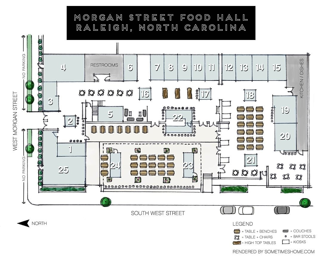
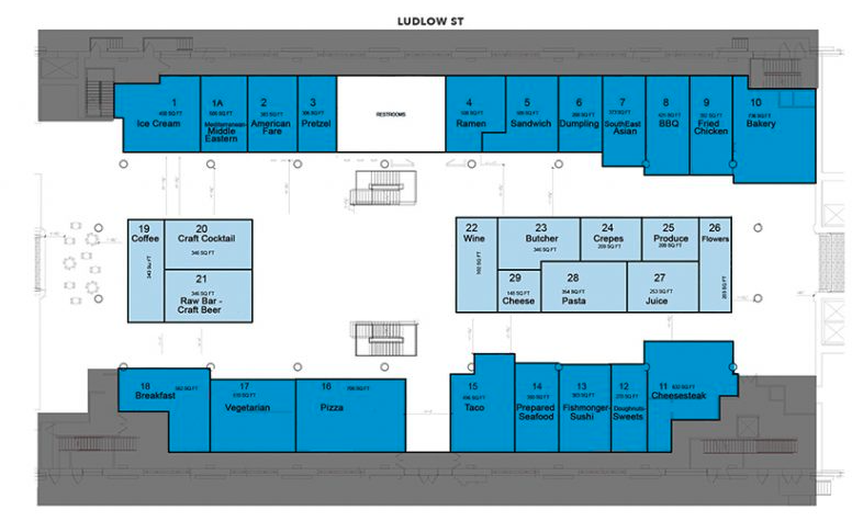
The Big View is used most widely in new food halls. In these halls, there is often a bar in the center of the room, flanked by a large seating area. Usually, all of the food options can be seen from any vantage point. The flow plan is naturally circular starting back at the beginning, meaning that there is no bad spot for a vendor. It’s the most photographable, which is a good choice for marketing, and (if you use the centered bar variant) it looks busy even when its slow. When the bar is not centered, one side is often flanked with an entertainment option. The downside to this format is that it’s generally space inefficient for fixed-rental business models. Most models that use this are heavily focused on onsite dining and have a hospitality vibe. You will notice that most people refer to this experience by the food hall name rather than the internal concept they intend to visit, which sometimes frustrates the food vendors. Most people feel the food can trend slightly pricey. These are often percentage rent models or a hybrid rental pricing models. They can be a tad more expensive to build because the MEP is spread out a bit. Vendor stall counts are typically 10-14.
The Flying Saucer has fallen out of favor in recent years, but was popular with some early food halls like Krog Street Market. This design is used to create a circular flow plan along an outside perimeter, while also creating the ability to combine exhaust and plumbing into a core that would be cheaper to build. A notable recent build is Optimist Hall in Charlotte. In many ways, the aesthetic is harder to get right and is subdivided. Alcohol beverage sales are lower, but there are economy savings for food purveyor participants. While they are easy to navigate, there are not many “shortcuts” through the projects, so you can almost never find your friends, who are inevitably on the other side. Vendor stall counts are typically 20-25.
The Maze format is heavily favored by fixed-rental models looking to maximize rentable square footage at the expense of navigability. There is rarely much seating but you may find standing tables or a curb to sit on. Service is almost always on paper. It does tend to work best in Europe/Asia where people are more comfortable sitting at counters and committing to a single concept. Notable greats on this standard in the US are Reading Terminal, Grand Central Market, and Dekalb Market. Vendor complain that invariably some stalls are “hard to find” or are farthest from the access points. Most people memorize their favorite stalls and how to get to them, but avoid new options, because it can feel “too risky to try something new.” Concepts often have plenty of competition within the actual food hall as verticals may be replicated many times. People generally refer to the specific concept rather than the food hall. These are typically found in high-density locations that can supply walking traffic as a requisite to deliver enough traffic to keep the multitudes of businesses open. Vendor stall counts may exceed 25.
Overload is a favorite of first time food hall developers/designers. The plans look really cool on an overhead view. You’ll see radius bars, lots of counter seating, and random service islands everywhere. You’ll see non-standard perimeter shapes. Equipment areas in each stall are unique and seldom standardized. One stall may even be triangular (!). Back of house areas are built into every stall beefing up square footage, so that site lines are further obscured. The lack of a consistent flow plan is the only consistency. The ceiling is full of long exhaust channels running through the dining areas ($$$). Vendor stall counts vary widely.
So, how do you choose the one that is right for you? Firstly, there are really only three options. The last one rarely gets built anymore due to cost overrun. If it’s an ultra-dense market, a transit station, or you have a sea of parking on the side of an interstate, then The Maze is might be right for you. It’s loud, chaotic, cheap, and bustling. People will love it, but they won’t love it everyday, so you’ll need an unyielding traffic source. The reality is—that’s not most locations. So, you’re down to The Flying Saucer or The Big View. If your customer is looking for price point and only occasionally eats on site, then the Flying Saucer is probably your best bet. For most other applications, it might be time to think about a stellar hospitality vibe and the The Big View.
We’ll refer back to these design archetypes as we proceed with additional articles.
—-
Politan Group specializes in operating food halls, bars, and bars within food halls. We also provide remote accounting, HR, and administration for food halls. We offer operations oversight on a fractional basis. Finally, we sell software that organizes much of the routine processes. If you are thinking of building a food hall or need help with an aspect of a food hall you already own, reach out to us. Politan is the most-awarded food hall operator in the industry.
